HEML Guide
Getting started
Lets build out a simple welcome email with HEML!
The first thing we'll want to do for our email is add our <heml>, <head>, and <body> elements. We'll add our style and meta elements in the head, and our content in the body.
<heml>
  <head></head>
  <body></body>
</heml>
Our metadata
We'll add a couple of meta elements to start: <subject> and <preview>. Our subject will appear in the title if the email is viewed in a browser. The preview will show up in certain clients, like Gmail or Apple Mail, which show a snippet of what's inside an email before you open it.
<!-- inside the head -->
<subject>Email is awesome</subject>
<preview>Learn about all the cool things you can do with email today!</preview>
The layout
Inside the body, add a basic one column layout. This will be 600 pixels wide, or 100% percent of the client, whichever comes first.
<!-- inside the body -->
<container>
  <row>
    <column></column>
  </row>
</container>
Writing our story ✍️
Inside of our column, lets create a header and paragraph welcoming the user.
<!-- inside the column -->
<h1>Hey there! 👋</h1>
<p>Thanks for giving HEML a try! Let us know if you run into any issues or build something awesome with it!</p>
Next, lets add another row, this time with three columns. Inside them, we'll explain some fun ways to use email.
<!-- after the first row, inside the container -->
<row>
  <column>
    <h3>Make games</h3>
    <p>The dynamic duo, Camiah, have made some awesome games in emails!</p>
    <button href="https://codepen.io/reallygoodemails/pen/WGzdXk">Sweep bombs 💣</button>
  </column>
  <column>
    <h3>Show a slideshow</h3>
    <p>Lego sent out an email showing off some of their new sets.</p>
    <button href="https://codepen.io/reallygoodemails/pen/EXdgjY">Check it out 🕵</button>
  </column>
  <column>
    <h3>Win back customers</h3>
    <p>Really Good Emails has collected a series of emails to win you back.</p>
    <button href="https://reallygoodemails.com/category/promotional/winback/">Open your heart ❤️</button>
  </column>
</row>
Let's also drop in a horizontal rule between our two rows to give them some space.
...
<!-- in between the two rows -->
<hr>
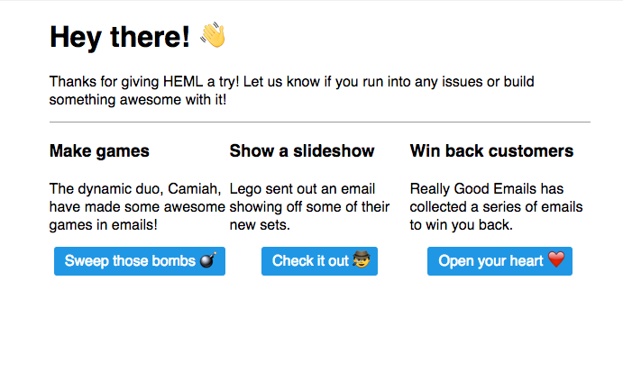
You should have something that looks like this.

Painting the canvas 🎨
Now that we have our email built out, lets make it look good. We'll add some styles so we have a white container and some black buttons.
To do this, we'll add a <style> tag to our <head> with some CSS.
<style>
  body {
    background: #EEE;
  }

  container {
    background: white;
  }

  hr {
    border-color: #DDD;
  }

  button {
    background: #333;
    padding: 10px 20px;
  }
</style>
This all feels a little tight though, so lets add some spacing and make it a bit bigger.
<style>
  container {
    max-width: 700px;
    margin: 10px auto;
    padding: 10px 20px;
  }

  button {
    margin: 10px 0;
  }

  column {
    padding: 0 10px;
  }
</style>
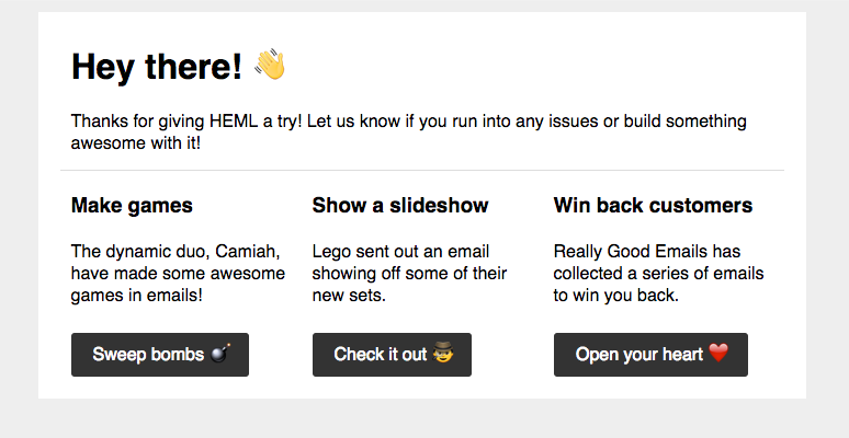
And there we go! Our awesome email, ready for the world!
